
I often hear clients talk about contrast between the molding and the paint color and I'm actually starting to think that less is more in many situations. When the contrast is subtle then it becomes more about the room as a whole contrasting the artwork or the furnishings instead of bits of contrast here or there shifting your eyes around the room but missing the whole.
I chose a subtle, muted color scheme without a strong contrast to the woodwork at our new house. When I did that suddenly our artwork came to life again in new ways because it wasn't competing with a strong wall color. Painting the walls and woodwork the same color can have that same effect. It takes courage but the pay off is rich, as you can see in the images below.
.jpg)
Barbary Barry image via Alkemie

Source: House Beautiful. Color is "Tobacco" by Pratt & Lamber. Designer is Barbara Westbrook.

Source: http://abigailahern.wordpress.com

Source: Apartment Therapy
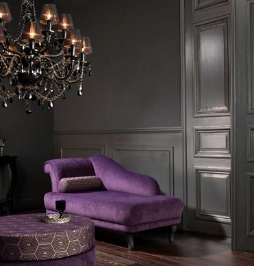
Source: http://mochihome.com

Source: Apartmenttherapy.com

Source: Apartmenttherapy.com

Source: House Beautiful

- Source: House & Home February 2010 issue
- Products: Wallpaper, Block Print Stripe (BP 748), paint, Blue Ground (210), Farrow & Ball; console, Stacaro; pendant, L'Atelier; lamp, At Design; art, Angus & Company; plant, Florigens Design; boxes, Hollace Cluny; side table, HomeSense; rug, chair, Elte.
- Photographer:

Source: Designer Meg Braff . In the family room, the walls are covered in a grasscloth wallpaper and then painted blue.

Canadian House and Home

Canadian House and Home

Canadian House and Home.

Canadian House and Home.

Source: Elle Decor
Canadian House and Home
Canadian House and Home.
- Source: House & Home January 2010 issue
- Products: Walls, Coventry Grey (HC-169), Benjamin Moore; pillow, Urban Outfitters; pheasant, Aberfoyle Antique Market.
- Photographer:
Canadian House and Home.
- Source: House & Home, February 2011 issue
- Designer: Steven Gambrel
- Photographer:
Source: Elle Decor
I love this idea. A few years ago I wanted to paint our dining room walls and trim one color but chickened out. The room was going to be all a beautiful french blue, but half way through I panicked, thought it would darken the room too much and now have a haphazard blue on bottom, cream on top, and white chair rail. Which all somehow manages to remind me of Baskin Robbins when I look at the room. Thanks for showing that it can be done and how great it can look.
ReplyDeleteDecorating is an adventure! We all have our challenges with color. I remember painting a room AquaFresh toothpaste blue/green once! Thanks for sharing!
ReplyDeleteWow, a really good point, and one that I had never noticed, nor thought of until now. I especially like how this looks in rooms painted a darker color. Goodness, I wish I had the guts to go dark.
ReplyDeleteCamille.
P.S. I think I'm using a picture of your kitchen in a post scheduled for Tuesday. I need to dig through your blog to be sure.
This comment has been removed by a blog administrator.
ReplyDelete