Friday, September 28, 2012

A Tour of One of My Favorite Shops in France: esprit de sel


Esprit de Sel was one of my favorite shops in all of Europe this summer!  Unfortunately, I discovered it too late.  We were driving in Carcassone, France after an already long day of exploring when I begged my husband, "Stop the car! I HAVE to go in that store!"

So, I jumped out while the crew stayed put. Any shopping trip with a husband and kids sitting in the car waiting isn't going to be a good one but I grabbed my wallet and camera and hoped for the best!

I was greeted by the lovely owner, Jocelyne Feller


Jocelyne is such a talented curator.  She has an eye for a broad range of styles-- retro, vintage, contemporary, quirky-- you name it.  It's such an eclectic shop, and it all blends together beautifully.


 From clothing to umbrellas, suitcases, boots, soaps and lotions, ornaments, lampstands, ceramics, and furniture, the shop goes on...and on...and on.


I was surprised to see more rooms beyond this doorway.

 
Even the hallway was packed with eye candy.
 

Where did this lovely gallery come from?

This teeny tiny nook filled with the unexpected was a fun surprise. 


Such a cheerful collection of pillows, linens and duvets.  I wish I grabbed that pillow in the bottom right hand corner!

Fabulous local art


I hope you enjoyed this tour of Esprit de Sel.  I'll be back!

Saturday, September 22, 2012

Before & After: A Living Room Transformed with a New Rug, Paint and Sofa... and Some Digging Through the Cupboards

Don't you love before and after photos? I especially like when the before and after incorporates what the client already has in her home-- just re-positioned or re-configured. This home featured below was like a treasure hunt. We literally dug around in my client's attic in search of vintage and antique pieces to incorporate into her fresh new living spaces. Below I show you what we did to her living room in just a few short weeks.
  
Everything in this photo already existed in my client's home. I just put them all together here.
 
This is the before photo of her living room.  There we are sitting on the sofa thinking about what needs to happen to create a home my Client will love with what we've been given.
 
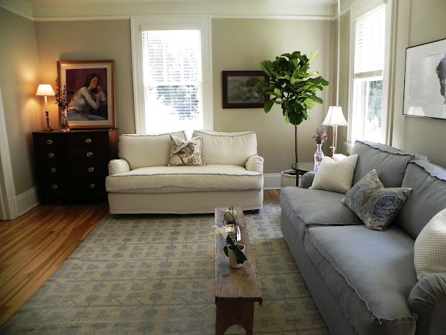
This is the living room after!  We had the room painted and purchased sofas from Quatrine, a beautiful light and airy rug from Tony Kitz, a plant from the Flower Mart, pillows from Pottery Barn, and end tables from Crate & Barrel.  Everything else you see in this photo my client already had throughout her house. (We actually did order new, larger table lamps but they were on back order when I snapped this photo).


We moved the dresser to the opposite side of the room and took that family painting and propped it on the chest.  The other painting to the right was dug out from the attic.

 Another before shot.  Since recovering this chair wasn't in the first phase of the budget, we used a piece of leftover fabric (from the Alameda Flea market) from recovering the dining room chairs to breathe new life into this tired chair...


 Voila!  Now this old chair has a fresh new look.  We stacked old books from the bookcase next to the fireplace and found that great old Royal Crown Cola box in the office to prop on top for a make-shift end table.  We took a mirror from the hallway that was too small for the space and placed it over the fireplace.  The two paintings on top of each other to the right of that mirror were a perfect fit.  We found the basket and the plant and brought them together.


You may recall seeing this potted head in the fireplace.  We found a new home for him right here.  Everything in this vignette was pulled from their house.  Sometimes we had to dig through cupboards.  Good thing our client let us scour the place. She and her husband have a fabulous collection of antique and vintage items all over the place!


I couldn't resist picking up a trendy but perfect-for-the-space fiddle leaf fig


This area rug is so beautiful in person. These photos do not do it justice!  This lovely piece was definitely an investment but with all of the money we saved re-using what my client already had, it felt good to splurge.  The bench was brought in from the front porch and was just the right size so the boys can still wrestle around on the floor without banging their heads!
  

I hope you enjoyed this tour of my client's home and are inspired to dig through your own cabinets and closets to re-purpose what you already own.  Happy hunting!

Tuesday, September 18, 2012

Opportunity to Own a Beautiful 1700 Square Foot Flat in Pacific Heights

I toured a recently renovated 8-unit building in Pacific Heights last week. It hit the hot San Francisco real estate market on Sunday but the building is not in MLS just yet.  I felt good about the quality of the renovation and the developer selling these units so I thought I'd share this project with you.

2541 California Street #7, San Francisco, CA 94115
Welcome to 2541 California Street

2541 California Street #7, San Francisco, CA 94115
This is the kitchen in one of eight units.

2541 California Street #7, San Francisco, CA 94115


The developer, First Abode, is a feel-good real estate development company and it shows. They've had the same, well-taken-care-of-work crew for over the past decade, a strong eye for design,  and a commitment to green remodeling.

home
In fact, not only does this refurbished building have electric car chargers for each unit's parking space, but the first buyer to close escrow gets a free two-year lease on a Nissan Leaf electric vehicle! 


And, First Abode really seems to go the 'extra mile' in their renovations. So often, I see developer flips where they cut corners, ignore glaringly obvious (and easy) fixes like widening the doors to a deep, dark, Edwardian, bedroom closet. (That is a huge pet peeve of mine that I came across last weekend at an open house). I call these "paint and pillow" flips.  The developer thinks a few cans of paint and some smart staging will turn a quick profit.  First Abode isn't a paint and pillow developer.  They have a lot of pride in their renovations and it shows.

This particular building, 2541 California Street, is in the Pacific Heights neighborhood of San Francisco, and is steps from Fillmore Street.  If I wanted to live walking distance to shops and restaurants in San Francisco (who wouldn't?!!), this is the location I would choose. 

Beautiful FIllmore Street

Fillmore Street has wonderful boutiques and loads of charm and when you crest the hill, fantastic views of the bay. 


2541 California Street offers eight three bedroom, two bath tenants-in-common (TIC) homes for sale.  Each is loaded with light, closets, access to the outdoors, environmental friendly features, and crisp modern finishes.  What more could you ask for?

2541 California Street #7, San Francisco, CA 94115
 
2541 California Street #7, San Francisco, CA 94115

TICs are an alternative way of holding title in San Francisco for properties that look and feel like condominiums but aren't. Usually they are former apartment buildings that have been converted to TICs.  Individual TIC owners take  a percentage interest in the entire building with exclusive use of their individual units.  They are less expensive than condos.  

2541 California Street #7, San Francisco, CA 94115
 
2541 California Street #7, San Francisco, CA 94115

2541 California Street #7, San Francisco, CA 94115

2541 California Street #7, San Francisco, CA 94115


The first property my husband and I bought in San Francisco was a TIC.  We purchased ours because we were able to obtain a TIC unit similarly sized as a condo but our TIC was completely renovated for the same price as an unrenovated condo.  And, we simply converted the TIC to a condo in a few years.  Nowadays they have fractional financing with competitive rates so obtaining a loan is even easier for these multi-unit buildings, and there is less pressure to condo convert.  Although only 2-6 unit buildings can convert to condos anyway. 

The units in this building would sell for considerably more if they were condos so they are great options for first time home buyers who value owning a completeley remodeled unit!

2541 California Street #7, San Francisco, CA 94115
Fabulous cabinet color

This particular property has a contemporary feel.  First Abode removed the Edwardian charm of the original building in exchange for a more functional and usable floor plan.  No more sleeping next to the kitchen!  The units are surprisingly big-- more than 1,700sf a piece.  There is a three story house in my neighborhood for sale that's 1,700sf!  The amenities are high-end and the finishes are crisp and clean.

Some of the environmentally friendly building features that make this property stand out from other more common developer units are:
  • Solar panels
  • Hydronic multi-zone in-floor heating
  • Insulation in floors, walls & ceilings made of renewable & recycled content
  • No formaldehyde-based materials or products
  • All paints used are low/no VOC
  • Electric car chargers in each parking space
Some of the new building features include:
  • Rebuilt building with seismic upgrades including new foundation & structural steel framing
  • All new Marvin double pane windows & French doors
  • New electrical & plumbing systems
  • New exterior siding & stucco

Overview of the individual homes:
  • Three bedroom, two bath homes
  • Master suite with walk-in shower, lacquered double sink vanity and Caesarstone counters
  • Built in AV system with in wall iPhone/iPod docking system
  • Secure, remote video entry system
  • Chefs kitchens with floor-to-ceiling cabinetry, professional grade stainless appliances, Caearstone counters and hand-tiled backsplashes
  • Hand-tiled baths with Grohe fixtures, lacquered vanity
  • In-unit laundry closet with hookups
  • Bottom two units have decks and private yards
  • Middle four units have decks off of living room
  • Top floor units have terrace off living room & private roof decks. Top floor also has skylights in the master bedroom, master bath & kitchen
  • Private storage for each unit
  • One car parking for each unit
I hope you enjoyed these fabulous units!  They aren't on MLS just yet, so if you want more information on showings and purchase details, go to www.2541california.com.


2541 California Street #7, San Francisco, CA 94115
 
2541 California Street #7, San Francisco, CA 94115

Friday, September 14, 2012

I Spy with My Little Eyes...Restoration Hardware in COLOR!

Have you all received your Restoration Hardware bibles this month?  I know they can be controversial but I do find them useful.  I actually refer to them.  But one thing is for sure...that CEO LOVES black and white.  I was pulling out the catalog in front of a client and she immediately rejected it saying, "It's all too drab."  "It need not be dark and moody," I pleaded with her.  And then I showed her the colorful proof.

Did you notice designer Benjamin Dhong's transformation of a San Francisco row house in House Beautiful?  It's full of Restoration Hardware pieces and chock full of color.  I really think RH should feature homes like these on their site, or even in their bible instead of the homes they currently show in their Collection of Epic Proportions, for example.  These homes basically look like RH just dumped their catalog onto addresses around the world. Why not showcase how real homes take on different styles with RH furnishings?  Benjamin Dhong's latest creation is vibrant and modern, and not at all obvious about including Restoration Hardware pieces.

Let's take a look at Restoration Hardware in color...courtesy of House Beautiful and designer Benjamin Dhong...

living room
Recognize these chairs?
 
1950s Copenhagen Spitfire Upholstered Chair

Restoration Hardware's 1950s Copenhagen Spitfire Upholstered Chair

 
William Curtis Rolf: Staircase
 
AND this limited edition William Curtis Rolf: Staircase! 
 
Did I miss anything in this picture?
 
This one?  I'm sure I'm missing something.
 
 
Do these chairs look familiar?  They have custom fabric from the Design Center but the chairs themselves are from you-know-who...
 
 
Hello again!  Beautiful in green-- the color of grass and trees and nature!
 
Well, well, well...hello Josephine
 
Restoration Hardware's Josephine Chair
 
You might not recognize this desk but it's...
 
Restoration Hardware's Aviator Wing.  It takes on a whole new look when it's out of this monotone color scheme.
 
Is it me, or is this bed...
 
...from The Restoration Hardware Directoire Collection?  It looks so different with some juicy orange accents.
 
There's Josephine again...in the Far East!
 
Bravo Benjamin Dhong for mixing everyday people's furniture into the creation of this stunning San Francisco home to give it a "distinct and daring personality."  Don't you think if Restoration Hardware showcased homes like these in their bibles they would sell even more of their fabulous pieces (and  make my job of convincing people to buy them easier)?  Sigh...  It's not all black and white, though is it?